First impressions often leave lasting notions.Landing pages are one of the first elements of your business that your customers interact with. Hence it goes without saying that they need to come with impeccable design and brand placement.
This often translates to unwavering investments in terms of analysis, planning, and implementation of the best strategies that convert the maximum portion of your website’s visitors into customers.
But more often than not, marketers are left baffled due to the numerous available options in which this can be done. We have thus compiled a list of the 5 best strategies that will optimize your website’s landing page and increase your revenue along the way:
1. Cut Down the Clutter
It is often seen that marketers fill their landing pages with a number of interactive elements. Although these are intended to increase engagement, they instead end up being a huge distraction for the visitors.
So, what is the end game here? The idea is that the only thing your website’s visitors should be able to do is to interact with your CTAs. Anything else that grabs their attention would have an adverse effect on your conversions.
Here’s a quick case study. YuppieChief, a leading e-commerce store, went to the extent of removing the navigation bar from their landing pages. Although it was highly unusual to do so, signups increased by a staggering 100%!
2. Deploy the Power of A/B Testing
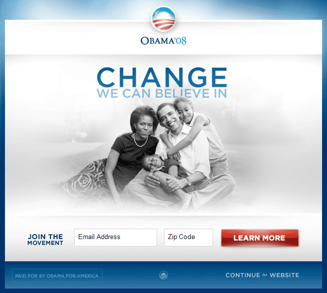
To give you a perspective, here’s a fact. While campaigning for the presidential elections in 2007, President Barack Obama successfully raised an additional $60 Million when his Director of Analytics decided to use A/B testing to determine the best landing page for their website.
For those who are not familiar with it, A/B testing is the process of increasing engagement on landing pages by using different versions of the same landing page for different visitors chosen at random. This helps to determine which page is performing the best at driving conversions by helping you choose the best version of your landing page.
Even Google has been using the concept for the past 12 years to determine the optimum number of results that should be displayed on a search engine result page. Hence, the importance of A/B testing cannot be stressed more.
3. Use the Right Type of Forms
Forms are one of the most common website elements that are used by websites to capture the details of visitors. Chances are you are using them right now somewhere on your website.
But do you know that even the number of fields in your form can have a profound impact on conversions? This is where a lot of marketers go wrong.
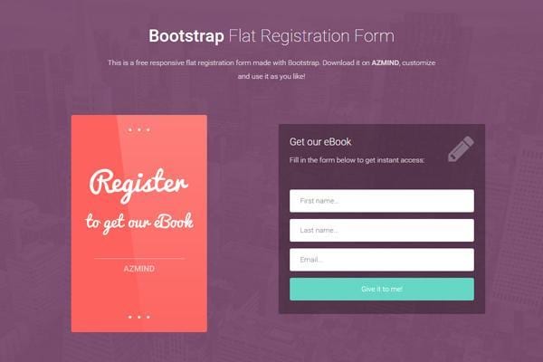
The average number of fields in a form is 11, while the most optimum number stands at 3! Even reducing the form to 4 fields can increase your conversions by 120%.
Along with the right number, it is also crucial to have the right fields. For example, the conversion rate is higher for forms that do not ask to mention the age. Same is the case when you use words like ‘phone’, ‘call’, or ‘address’ as field names.
4. Make your CTAs Clean
It makes no sense to put in hours of efforts to bring visitors to your website and give them the best version of your landing page, only to see them bounce right before they click on the CTA.
Your visitors should know exactly what you want them to do. This can only be possible once your CTAs are clearly visible and give out the right message.
Here’s how you can come up with effective CTAs that convert optimally:
- Use powerful and persuasive words to grab attention.
- Make the message relevant by using the right keywords.
- Make the CTA compelling to read. It should entice an action from the reader.
- Do not use words like ‘Subscribe’ or ‘Submit’ as they imply commitment rather than value. Be innovative instead.
- Never overuse sales oriented words like ‘Free’. These are extensively used around the Internet and thus have a negative psychological connotation attached to them.
- Make sure that the design of your CTA does not blend in with the landing page. It should stand out visually and demand attention.
5. Create Multiple Versions of Your Landing Page
And no this is not the same as A/B testing.
Multiple versions refer to different versions of the same landing page that are all active, exist in real-time, and are shown to visitors depending upon their demography or the phase of the sales funnel he/she is.
For example, an E-commerce website might show a different landing page to a visitor who already has the product added to their cart as compared to a customer who is visiting the store for the first time.
On the other hand, a website might have multiple landing pages in different languages/sections to cater to its extensive demography of customers that come from multiple countries. Plugins like custom content by country are popularly used for such purposes.
Some businesses even ask basic questions to website visitors and show them the most relevant version of the landing page based on their answers.
The idea behind such practice is simple – personalization helps to provide the user with an experience that is tailored to their needs. This makes them comfortable and increases conversions by multiple folds.
Conclusion
To sum up, you should optimize the page in a way that it motivates the readers to take specific actions, rather than focusing on your abilities. Optimizing for motivation often invokes emotions in visitors and makes them sensitive towards the fears and pleasures that are ingrained in them.
And whatever you do, never ever use background videos. Nothing kills conversion like a distracting background which is continuously contesting for the visitor’s attention.
The above steps can help you optimize your landing pages effectively.


